


Assignment:
For this project, we were given the text from the American Institute of Architects’ catalog, whose purpose is to be sent to guidance counselors, high schools, and other places to raise interest in architecture as a career. The book includes an informative section explaining architecture school, the examination process, and career options, and a catalog section where books can be ordered. An order form for the catalog had to be included within the catalog as well.
Execution:
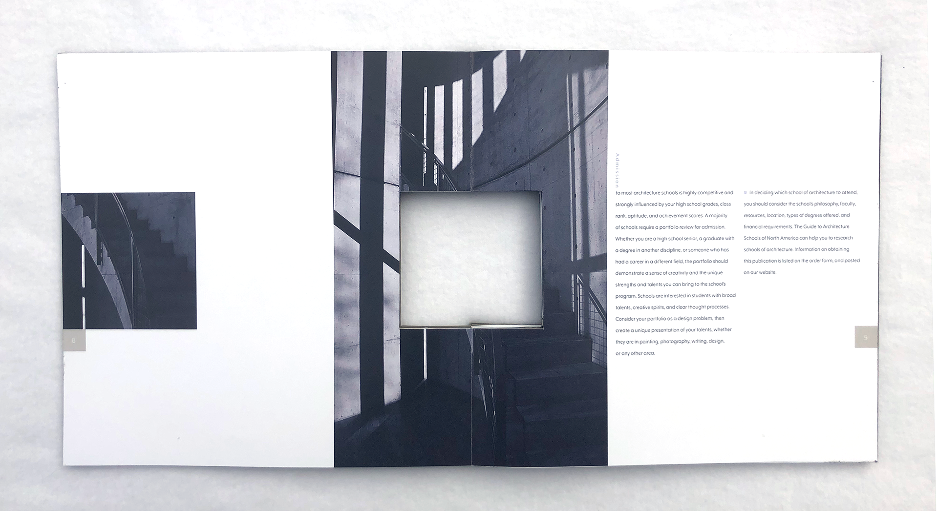
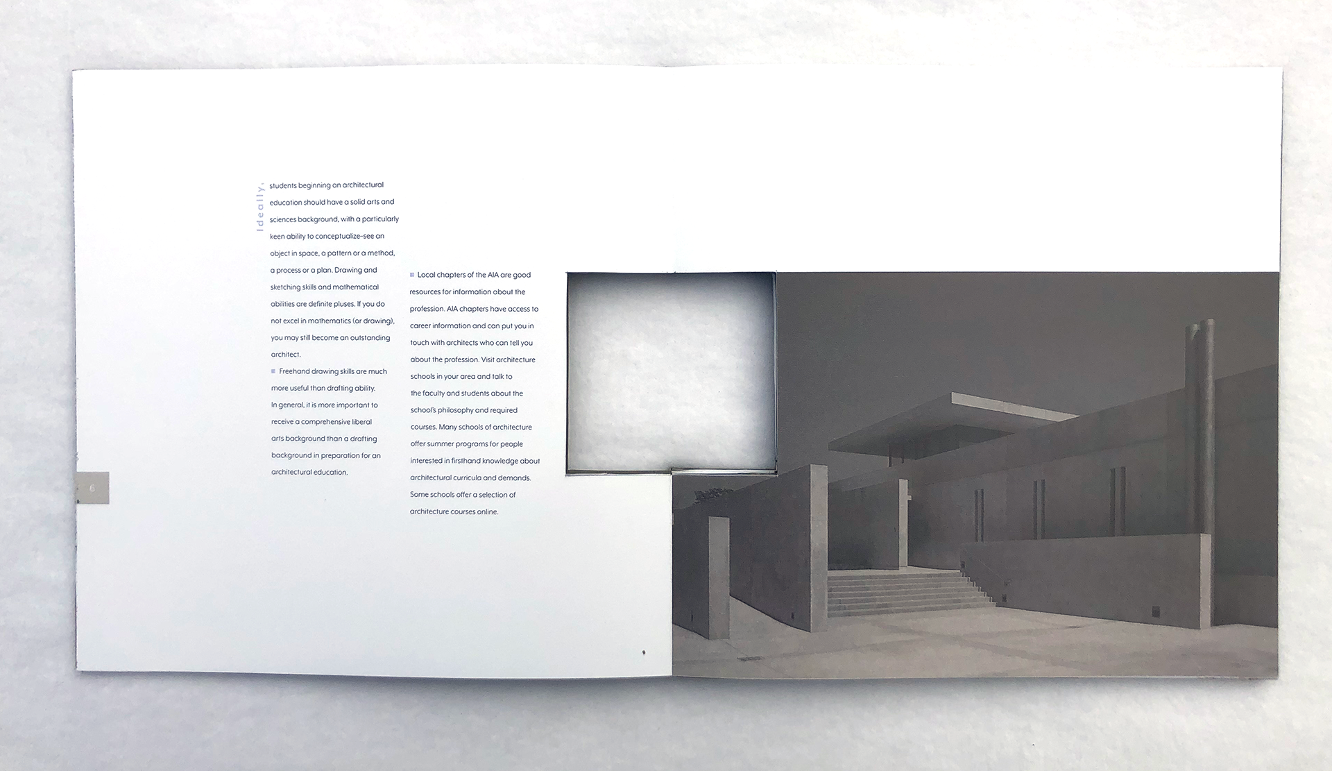
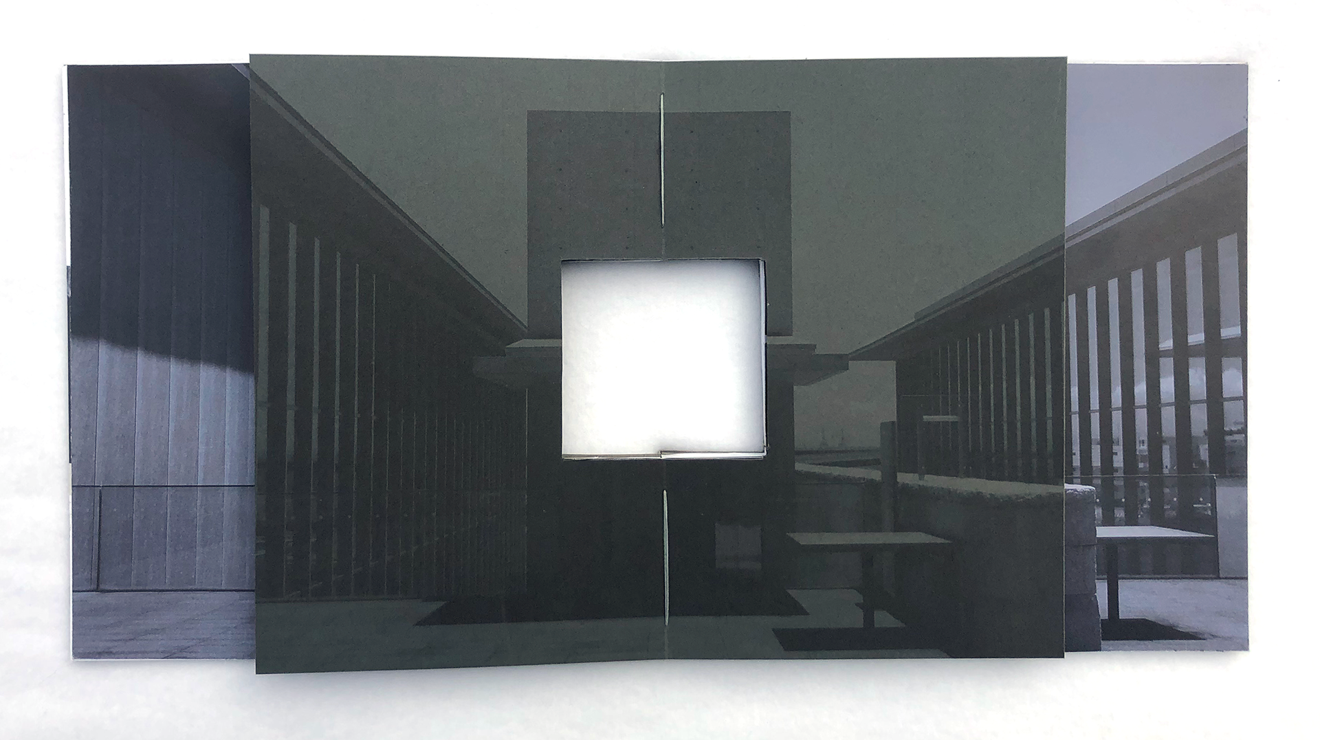
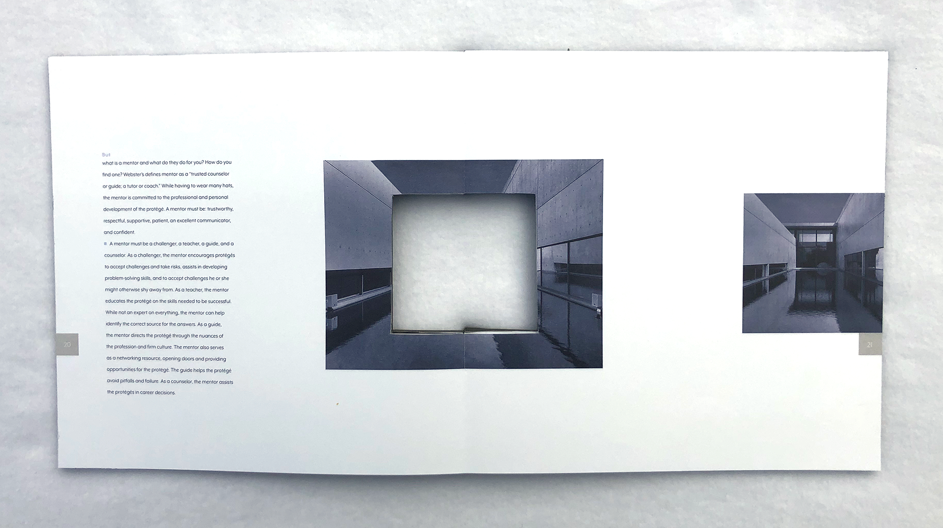
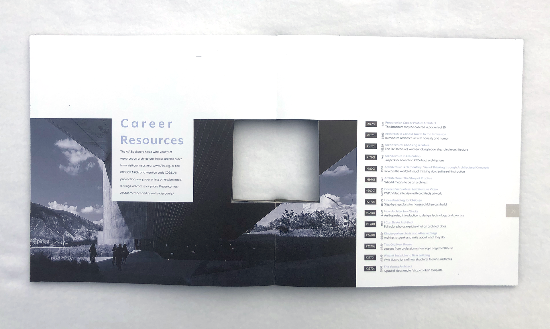
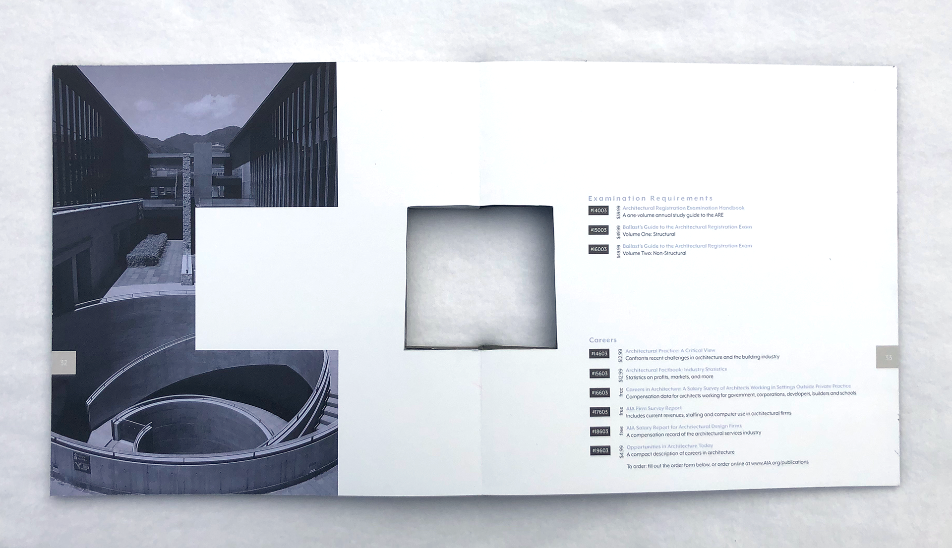
After researching many architects, I decided to base the imagery within the book around Tadao Ando, a self-taught architect from Japan. The “King of Concrete” develops simple buildings with dynamic shapes, allowing his buildings' interiors to have a mass amount of potential. While researching Ando, I found the following quotes that guided many of my design choices within my book;
“Ando also emphasizes the association between nature and architecture. He intends for people to easily experience the spirit and beauty of nature through architecture” [1]
“The simplicity of his architecture emphasizes the concept of sensation and physical experiences, mainly influenced by Japanese culture. The religious term Zen, focuses on the concept of simplicity and concentrates on inner feeling rather than outward appearance.” [2]
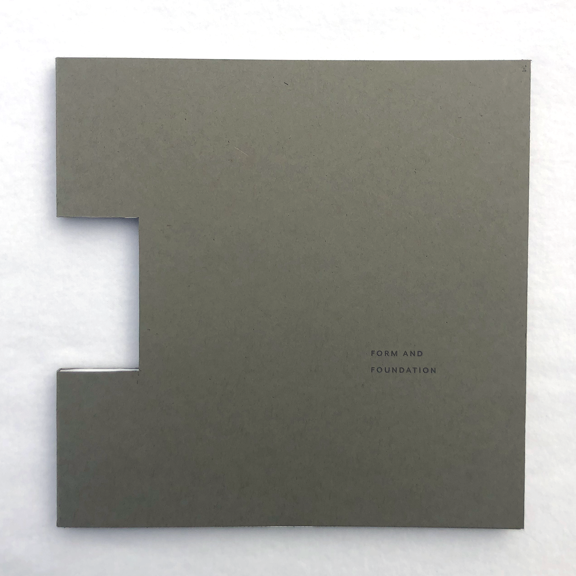
Due to the limit of 3 colors, deciding what colors to use was an early decision. I choose a cool-toned dark gray and a warm-toned light gray, ensuring I had the opportunity for strong contrast, especially for text legibility. One of the few colors consistently found worldwide in nature is the light blue sky, which led to the third color.
I mapped out and designed the book in a minimal fashion to take after Ando’s quote[2]. I expanded upon that by keeping the cover of the book simple to push the concept of “concentrates on inner feeling rather than outward appearance.”
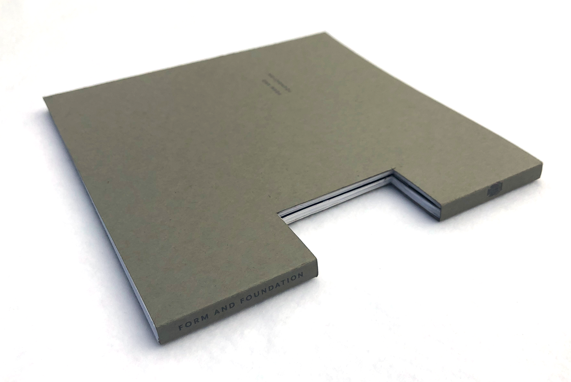
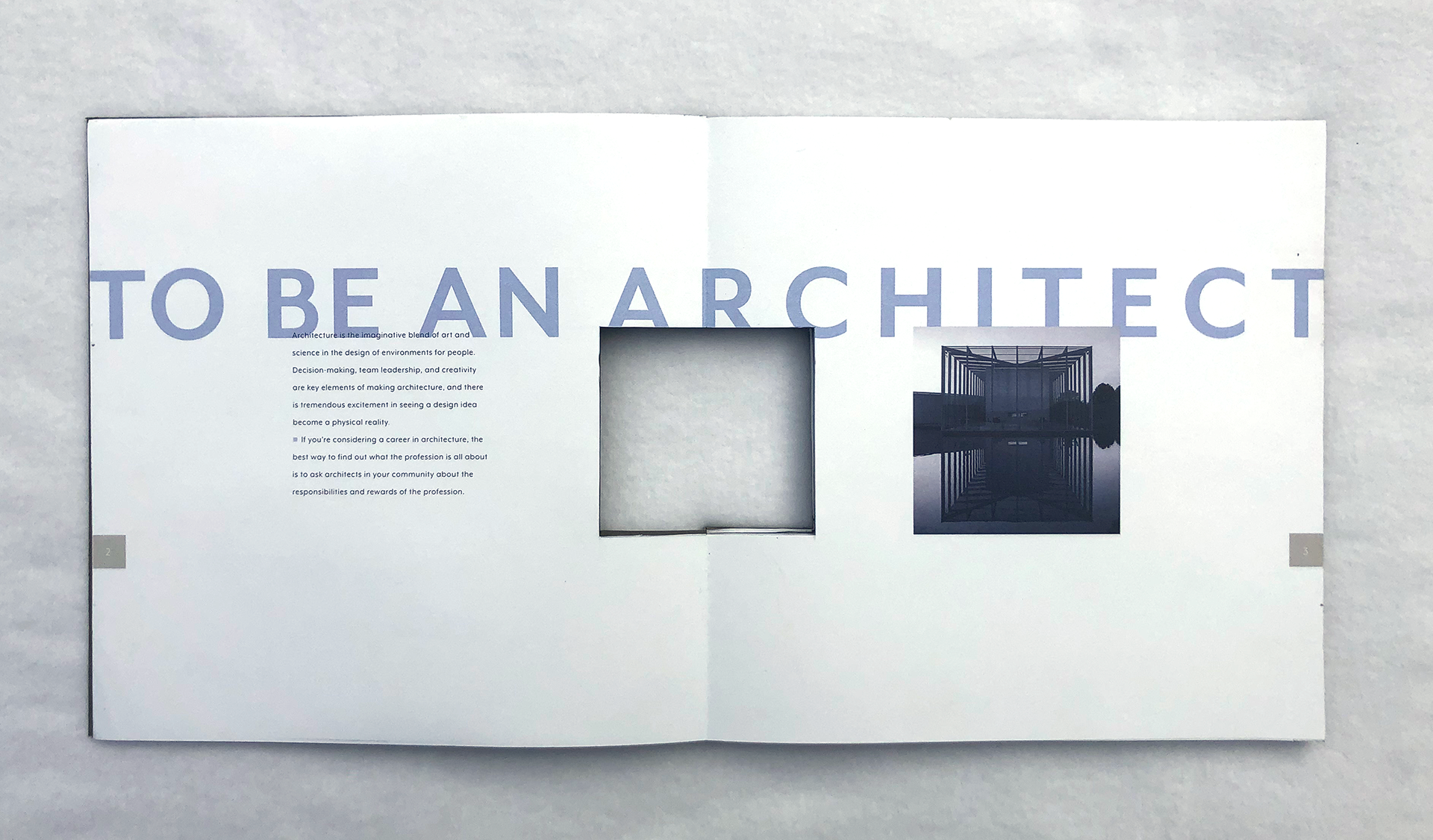
With architecture in mind, I interpreted the first quote [1] to be representative of windows, a way to “experience the spirit and beauty of nature through architecture.” I wanted to push my creative limits and decided to cut a window on the spine of the book. Using the window as a base, I developed a grid to use throughout the catalog that aided in content placement and pacing.