


Assignment:
For this project, we were required to choose a graphic designer from the 20th century to inspire our project. Using this inspiration, create a festival or event to create the marketing materials for. The festival was required to be a four day event, which required sperate tickets and allowed for collectables to be available that would create a collection if all four days were attended. Required deliverables included a poster, tickets, brochure, a t-shirt, and the collectables.
Execution:
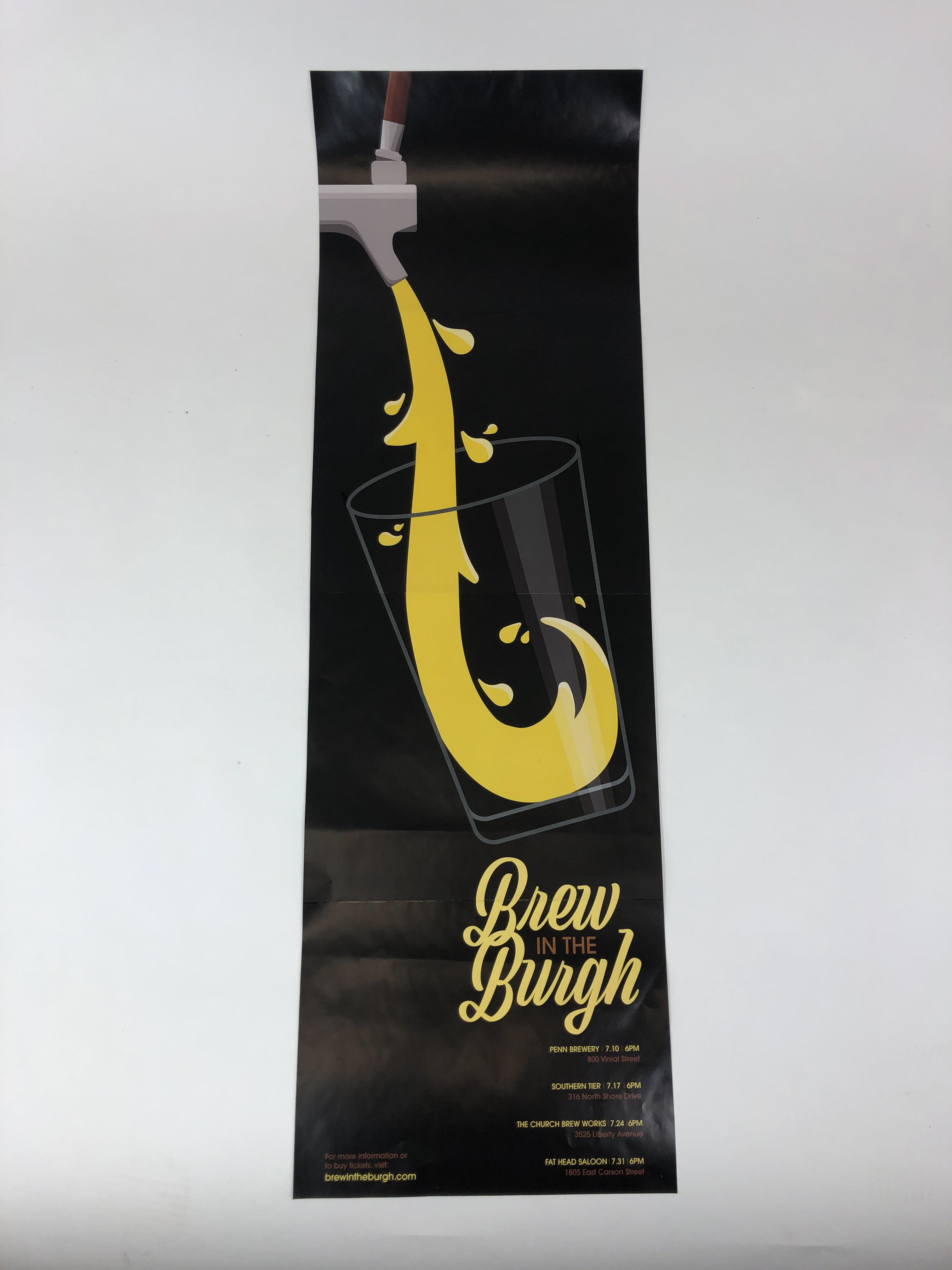
For my event, I decided to create a "Brew in the 'Burgh" event to showcase local breweries and draw customers to small businesses. (At the time, I didn't know a similar event already existed.) After researching many graphic designers, I choose Herb Lubalin as my inspiration, especially his use of script typography and overlapping and intertwined letter forms. I used "Viktor Script" to form the wordmark of the event and used Lubalin's own "ITC Avant Garde Gothic" as an accompanying font. I developed the color scheme by pulling colors from different colors of beer.
I wanted to make the poster different than the standard poster sizes because when many posters are placed on one wall, it becomes easier for the posters to become lost. I decided I could use a heavy emphasis on negative same and large imagery as other traits from modern design to follow and created a large, dramatic beer pour illustration. The imagery helped create a long, narrow poster that, with the large imagery, would help pull in viewers eyes.
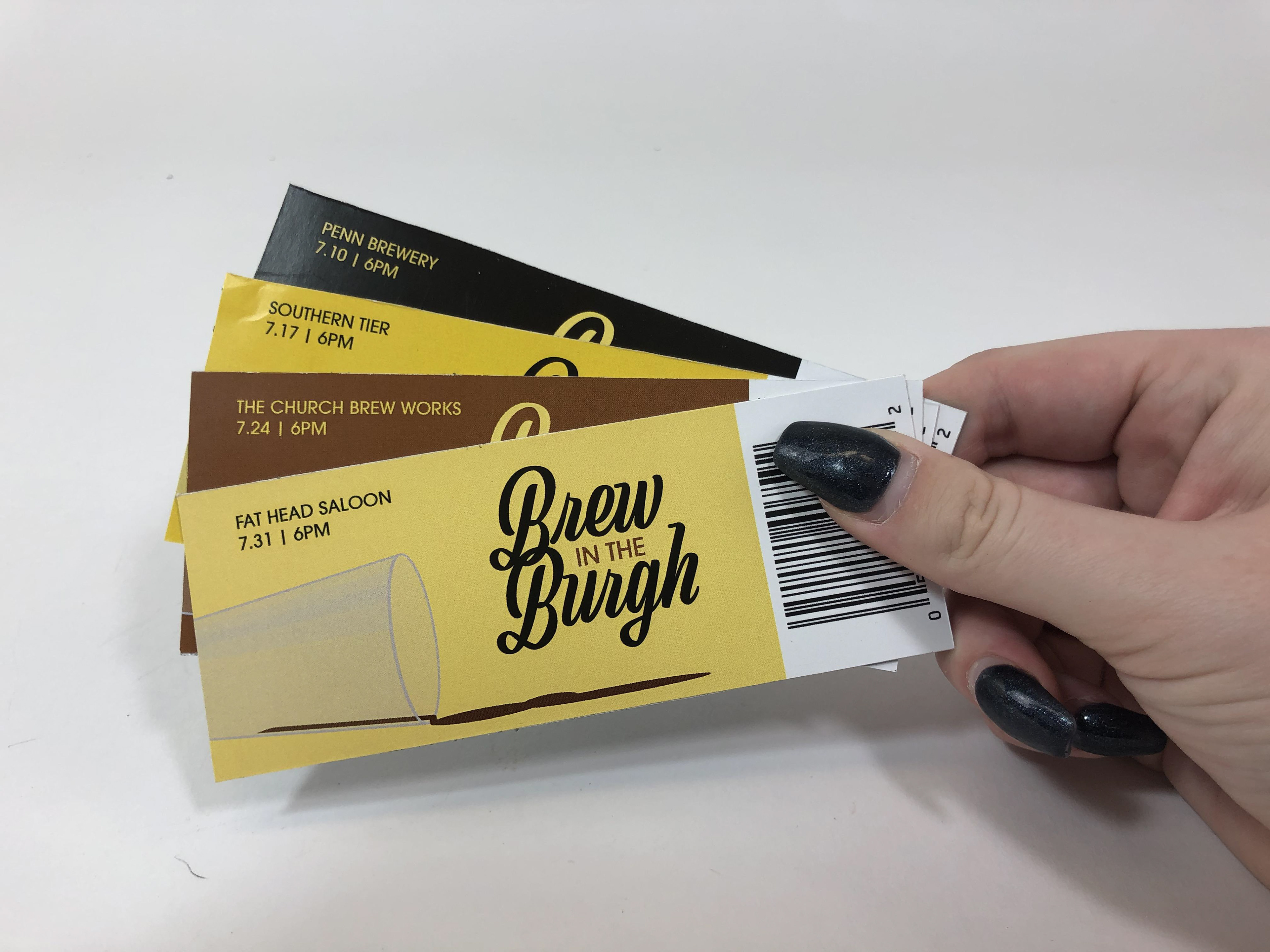
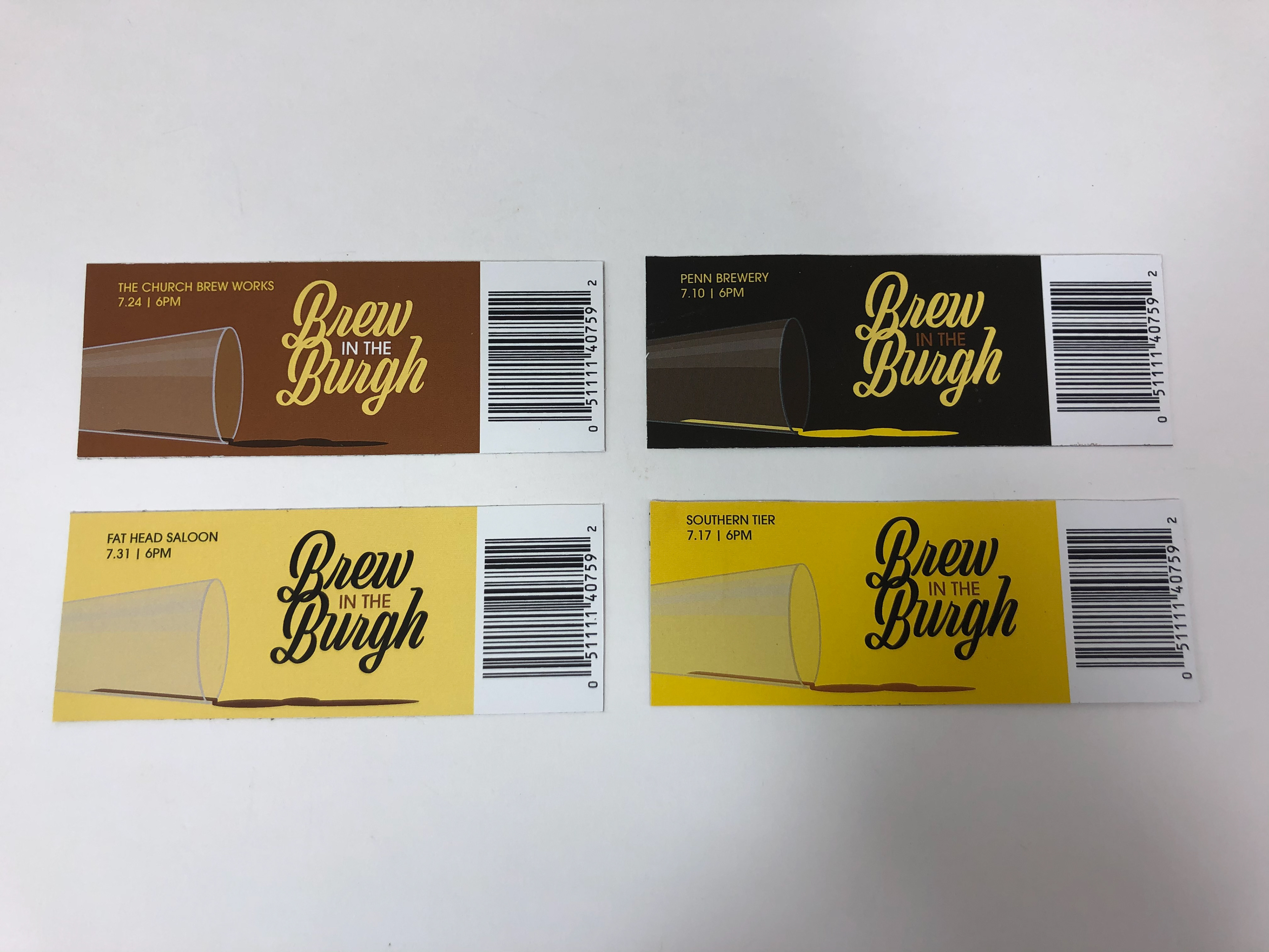
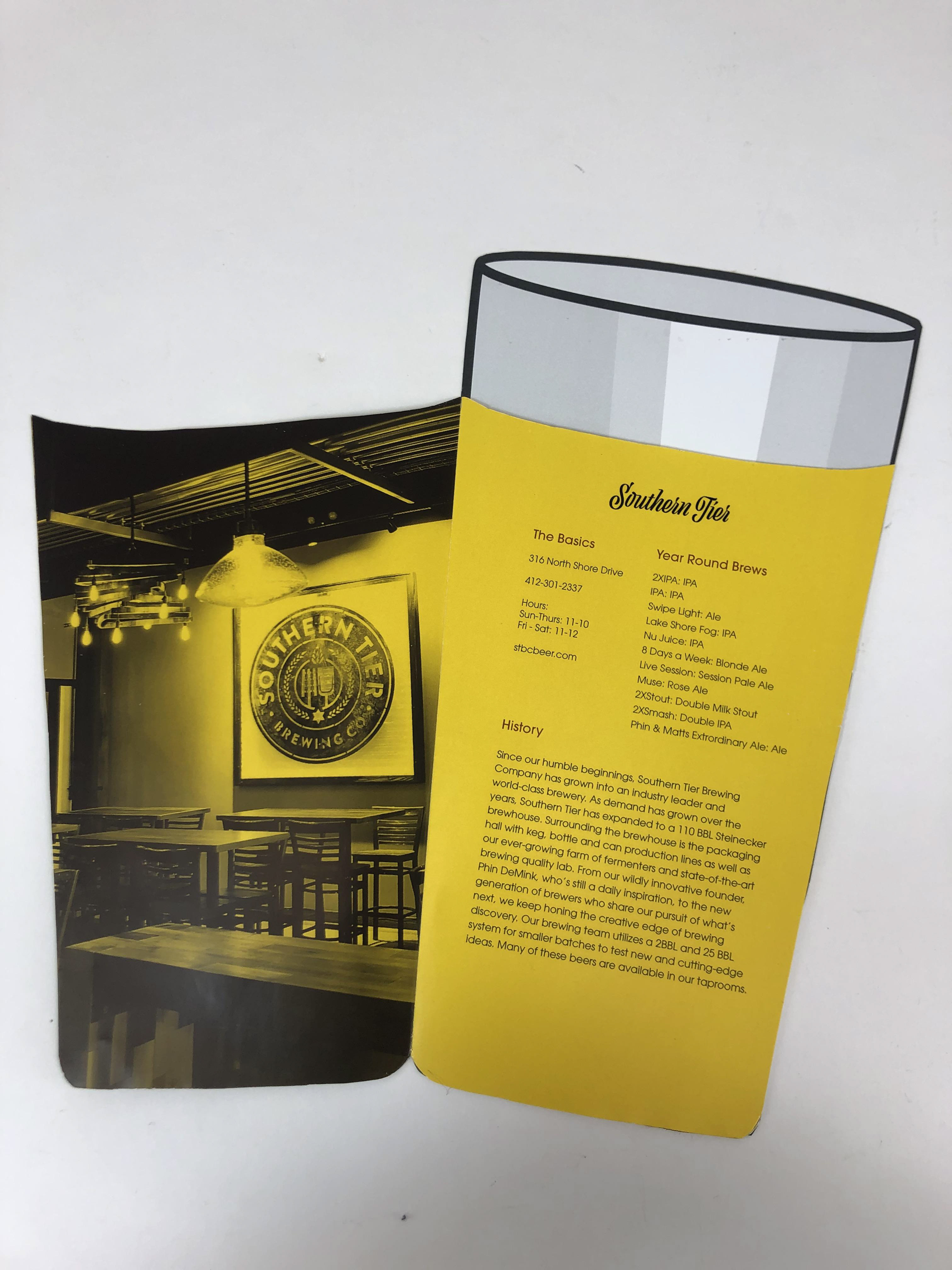
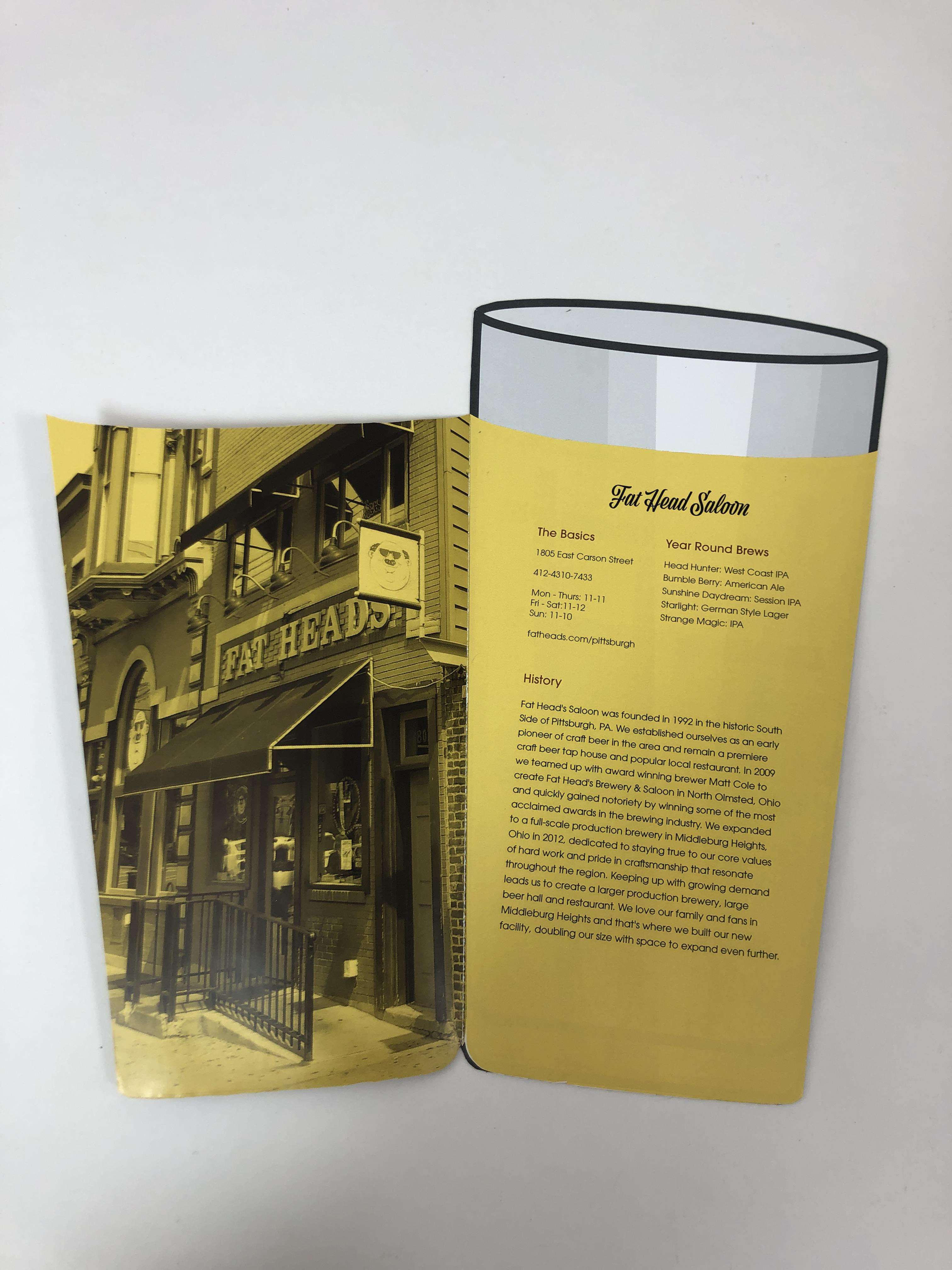
I carried the illustration of from the poster over to the tickets and changed the color of the ticket and the beer to create more visual interest. On the rear of the tickets, the names of each brewery are highlighted to show which tickets belong to which date. I also carried the imagery over to the brochure as well. Each brewery had a page to highlight their location and contact information, the year round beers that are brewed, and a brief history of the brewery.
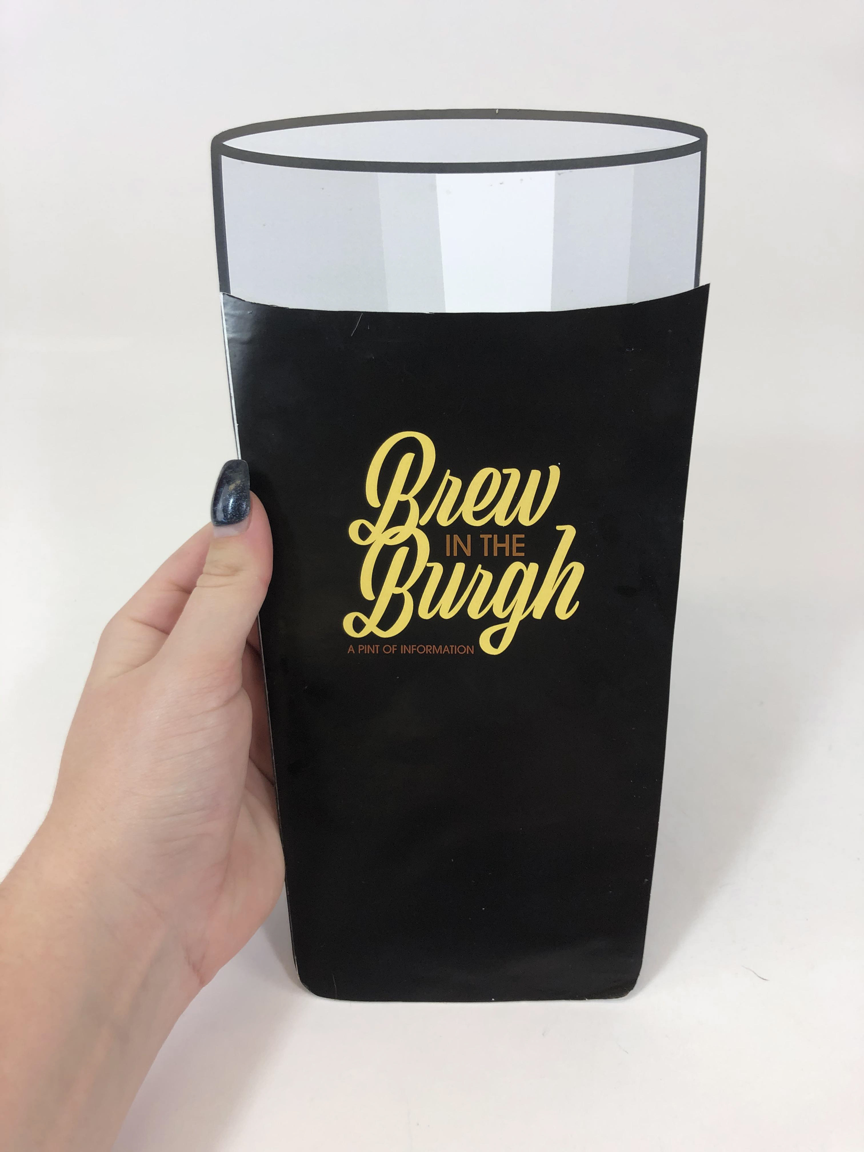
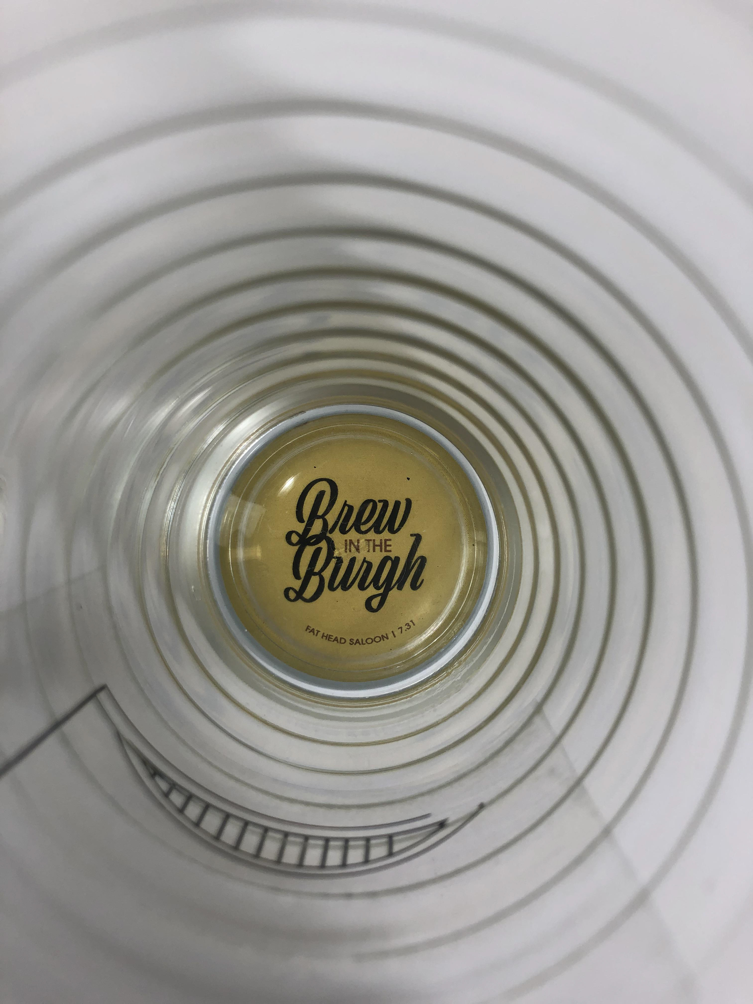
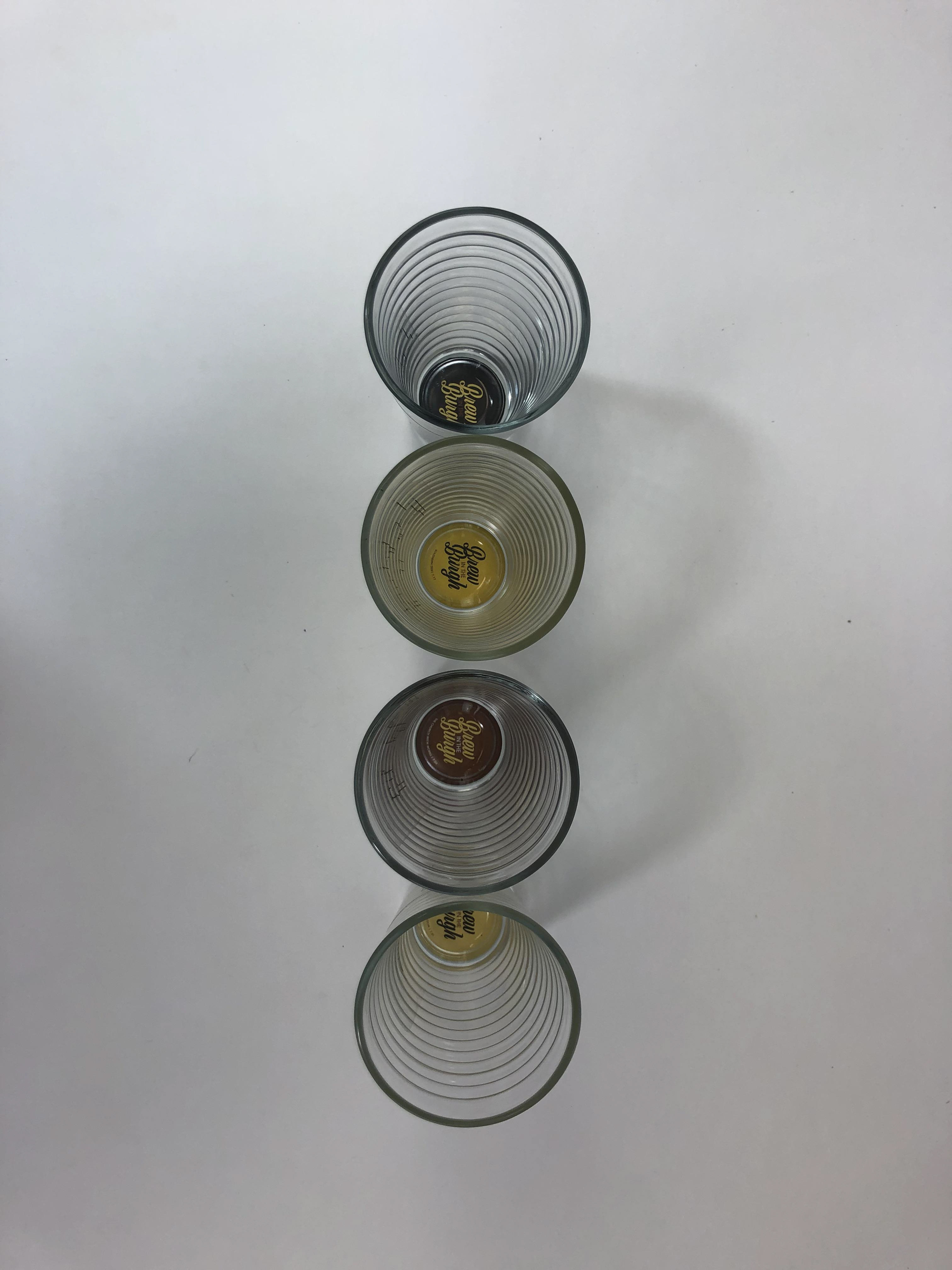
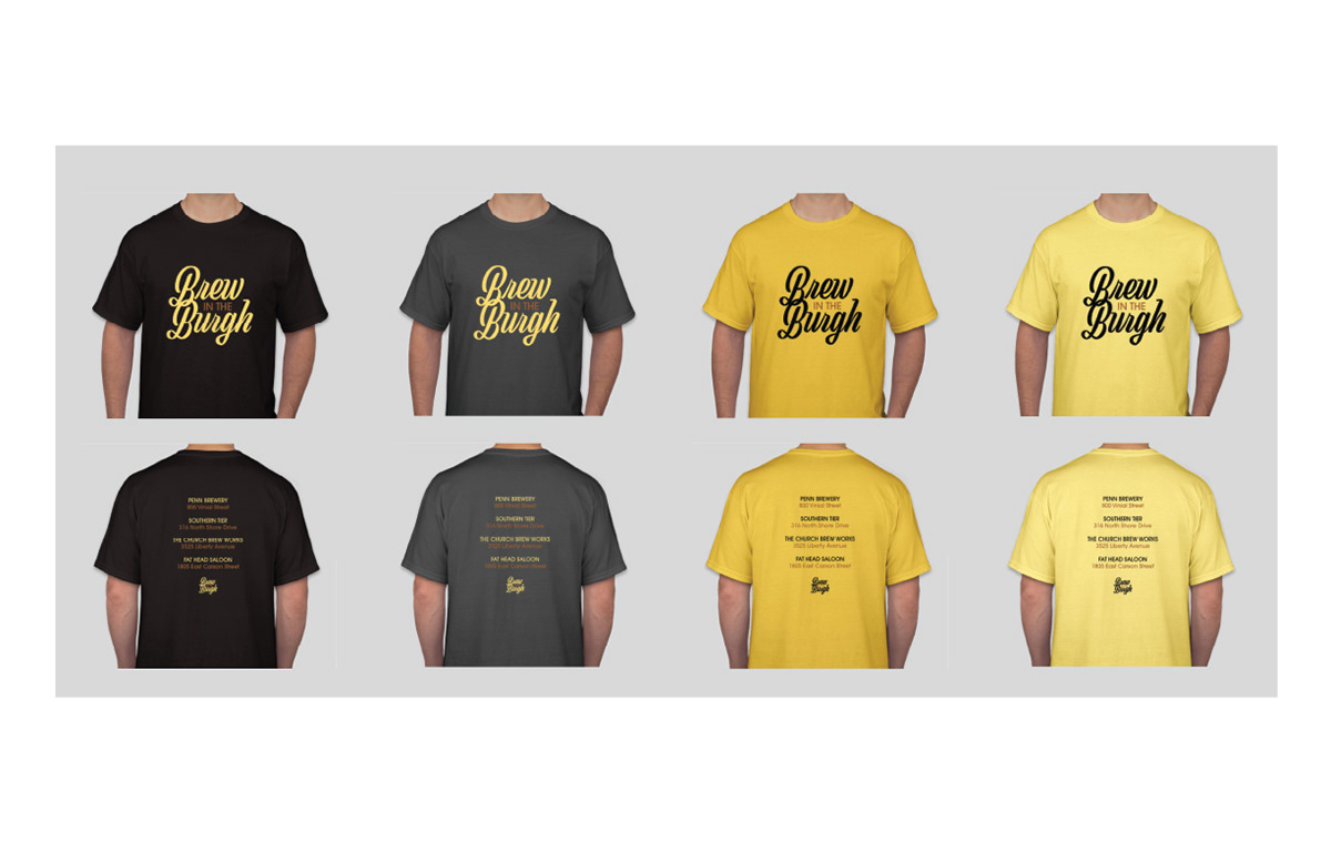
The final elements of the t-shirts and collectables came together as the wordmark was used on the t-shirts and the collectable items were pint glasses. The pint glasses had the name of the event on the bottom of each glass and when displayed together, showed Pittsburgh's skyline.